Adobe Inc. launches Spectrum 2 a new design system for all of its apps

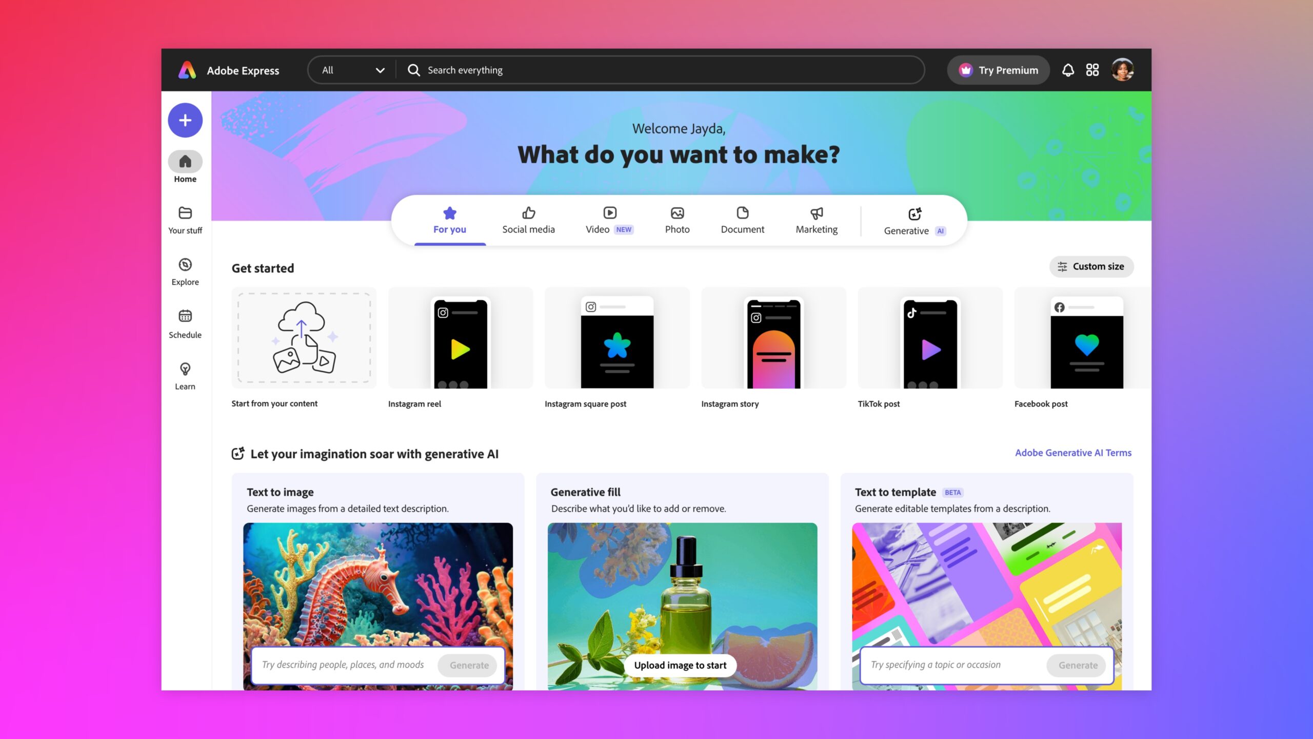
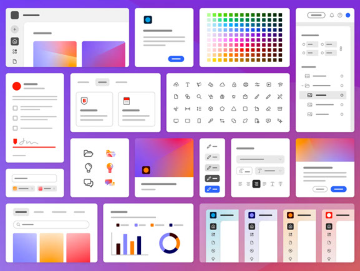
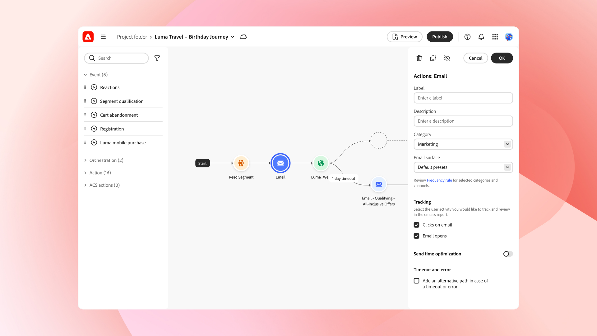
Adobe today launched an update to Spectrum, the design system the company has used as the basis for all of its app and web experiences for the last 10 years. Called Spectrum 2 (no surprise there), this new design system backs off a bit from the austerity of the current Spectrum design and adds quite a few more splashes of color to, as the company says, “make Adobe tools even more intuitive, inclusive, and joyful to use across platforms, while supporting our mission of enabling Creativity for All.” You can already find parts of Spectrum 2 in recent Adobe web apps like its Firefly generative AI service, Adobe Express and some of the new Adobe Acrobat web experiences.
Adobe says the team emphasized three areas in designing Spectrum 2: dynamic contrast and brightness, more accessible colors and attention hierarchy to prioritize specific visual elements.
Ahead of today’s launch, I sat down with Eric Snowden, Adobe’ VP of Design, to talk about the motivation behind this update and how the company plans to put it into practice.
Amazon will no longer accept Venmo as a payment option starting from January 2024
“At the highest level, there are a few changes that are all happening at the same time,” he told me. “One is: you know, Adobe is addressing very new audiences than we did 10 years ago when Spectrum 1 was created. Spectrum 1 is from 2013. Adobe is addressing a much, much broader audience than we were back then. We’re building accessibility and inclusivity into the products from day one — and when I say accessible, I both mean true accessibility — color blindness, WCAG standards, all that built into the platform — but also approachability, making sure new people can come in and be successful.”
He noted that Adobe also now offers products for significantly more platforms than 10 years ago, including tools that support VR. Basically, while the “old” Adobe was almost exclusively addressing professional users (and hobbyists with the motivation to learn its tools), today’s Adobe wants to address a far wider market that includes students, social content creators and small business owners, among others. In many ways, that’s been the core of Adobe’s strategy over the last few years.
Snowden noted that when the company designed the original Spectrum design system, it went with a very austere, grey and serious look. In part, that’s because the company wants to emphasize the creative work of the creatives and get out of their way. “We’re not trying to get away from that, but we are in a lot of areas of Adobe a creative company, and we want to bring approachability, brightness, fun and whitespace — and we’re just sort of looking at this in a different way now.”
Adobe will start rolling out Spectrum 2 by bringing it to its web and iOS apps first, starting with a first set of updates to the web apps in early 2024. Over time, it will also come to the company’s flagship desktop tools like Photoshop, Lightroom and Premiere Pro.
In total, Adobe plans to bring its new design language to well over 100 apps. Rolling out a new design system across such a wide number of applications is never an easy task. Just look at how long it took Google to bring its Material Design system to the majority of its services. Still, Adobe expects to be able to roll out Spectrum 2 to quite a few applications in 2024.
Snowden stressed that Adobe wants to continue to give its professional users the flexibility to use their tools just like they have before, but also provide a better out-of-the-box experience for those who are still learning how to use a certain tool. “We take that responsibility really seriously. But we also want to make sure that we’re keeping things modern and moving forwards where we can — making things easier for people. Accelerating creativity is — especially on the Creative Cloud side — one of our most important principles,” Snowden said — and added that he would got a lot of angry calls from his friends if he messed too much with the tools they rely on for their work day in and day out.
He did add, though, that the various product teams may use this change as an opportunity to highlight some of the newer tools that they have added over the last few years in order to highlight some of the more modern ways to do things that new users may not immediately gravitate to because they are a bit hidden in the current design.


